

Design System Designer, Research, and Motion Prototyping
2022
Figma (Interactive Components), CSS, Javascript, UserZoom
Design and business first wanted to align on validating the need for motion. For this, I collaborated with the UX researcher and marketing team, reaching out to survey 1000 ADT users (age 25 - 65) with 456 respondents.
I gained significant data on user exposure to motion (including favorite apps and motion patterns), and how motion could potentially enhance engagement and accessibility.

Next, I followed up the survey by diving into ADT's user groups and their needs.
I focused on interviewing two distinct groups — ADT's primary long-term users (50+), and digital natives (25-45), who ADT were struggling to get onboard.
I found older users needed motion to emphasize task completion for trust, drawing attention to alerts, and quickly identifying missed clicks.
Digital natives primarily wanted an engagement factor. They used words and phrases like "out dated", "slow", and "not cool" when describing their ADT experience.
This info, coupled with the survey, served not only as a benchmark for empathetic design later, but a crucial pitch, exciting business stakeholders about future possibilities.

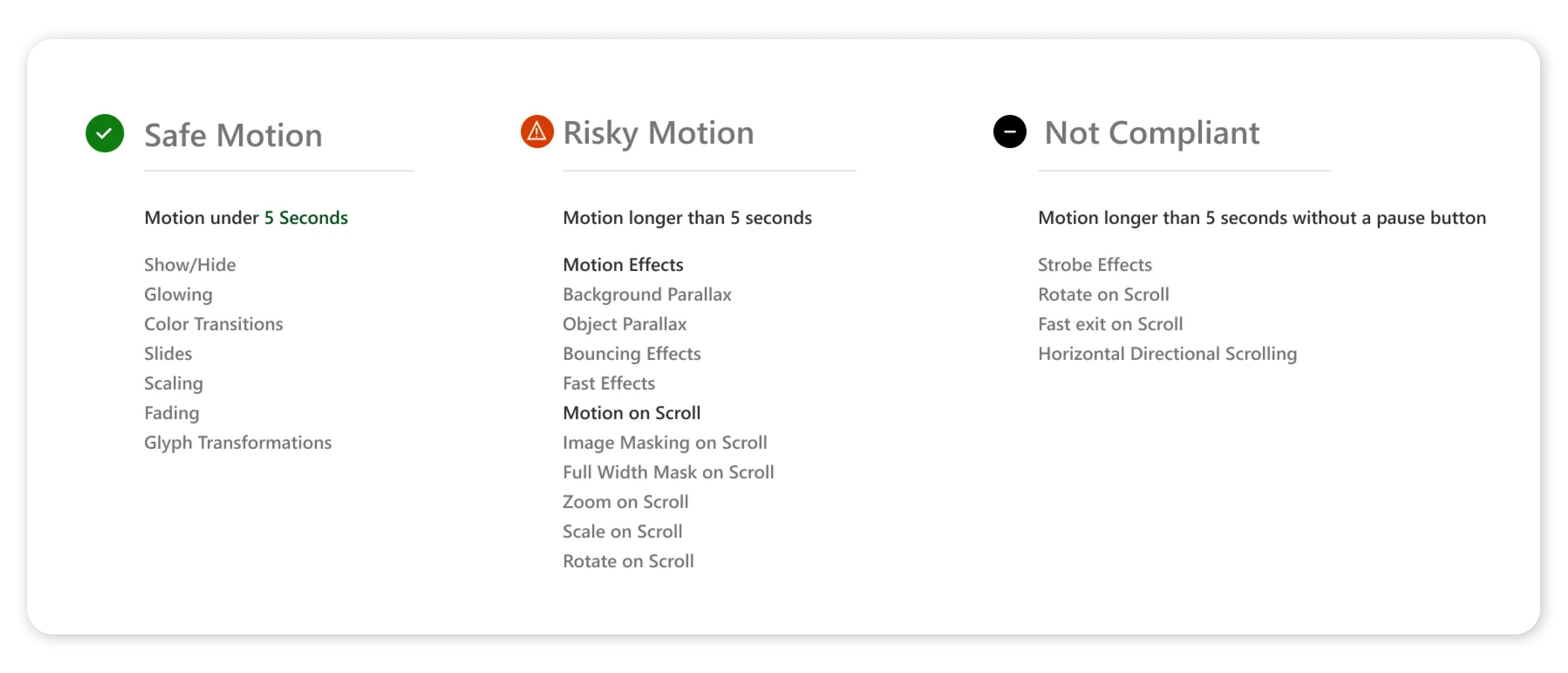
Key concerns with adding motion were potential accessibility issues. I became an expert on vestibular disorders, reduced vision, and triggers from motion. I evangelized these and ADA best practices company-wide, and added guidelines noting 'Safe', 'Risky', and 'Not Compliant' motion into the design system.
Analyzing motion design sections in IBM's Carbon Design and Google's Material Design served to establish more guidelines, understand general practices, and inspire me for how to add motion into our design system. Google's best practices were weighty given ADT's partnership with Google.
Examining motion patterns of direct competitors (Simply Safe, Vivant, and Ring) provided insights, particuarly on pitfalls. The Ring screen's parallaxing motion was considered unsuitable for accessibility standards.
I also found trendier competition, appealing to digital natives, such as Vivant, user motion more sparingly — utilizing primarily for emphasize when clicking a button or toggle.
Combing through any brand documents, such as tone and voice, design philosophy, or any other related info illuminates key words. I used these key words to gain a clear idea of what ADT's motion personality or brand animation would need to reflect. I opten for a balance of expression and utility in V1 of motion — Choreographing tasks, errors and alerts, and other components with the focus on increasing accessibility rather than sheer delight.
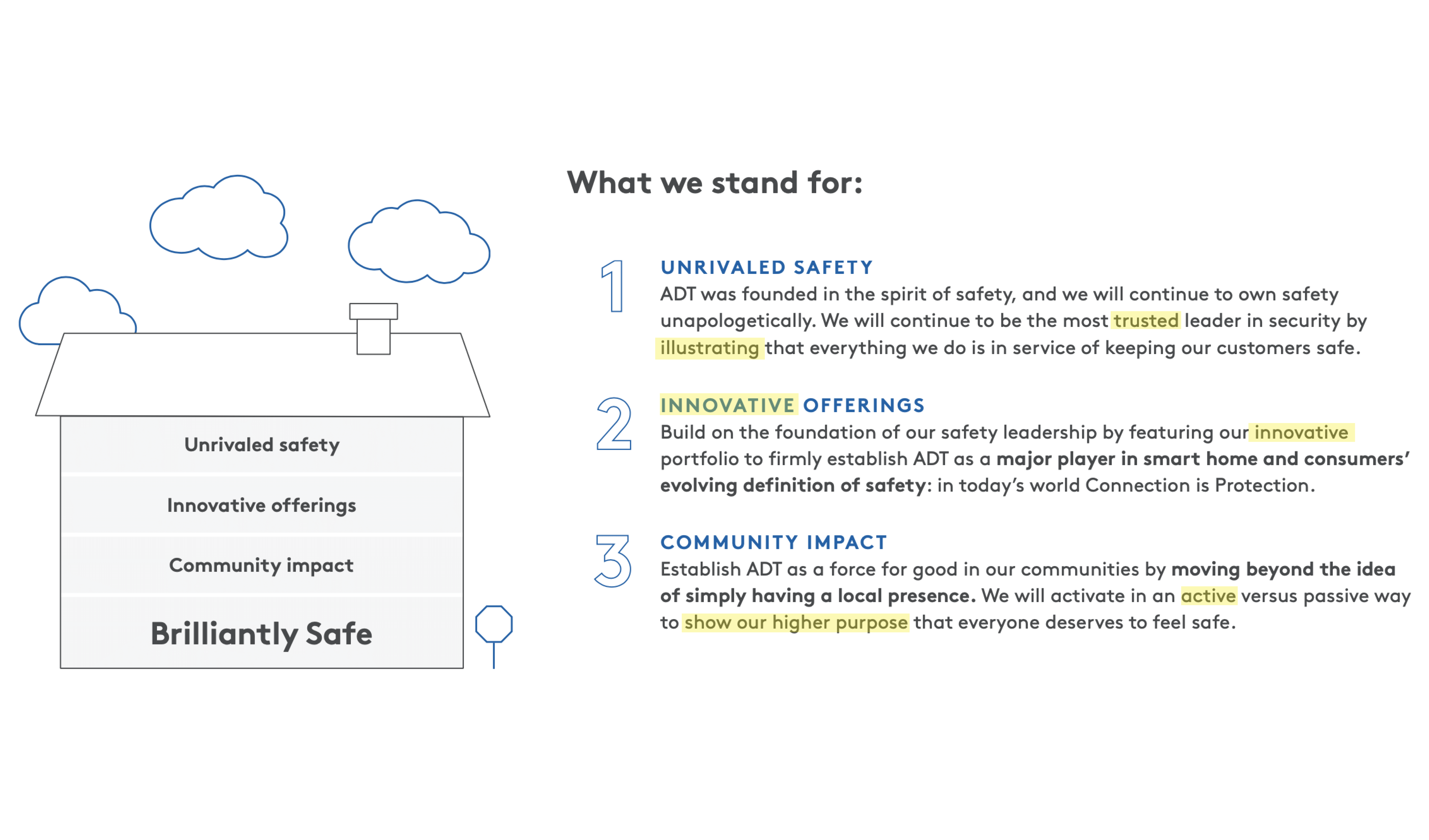
I created motion foundations for explaining best practices to design, development, and key stakeholders. This included do's and do not's present with animated examples using 4 principles (easing, overlap, relational motion, and entrance / exit). I initially coded these into a webpage for presentation and later reference. This gained stakeholder buy-in, and currently is featured on ADT's Zeroheight website.
A major concern for me was consistency — I didn't want development to have elements moving at different speeds with varying curves across the products.
After learning it was feasible, I decided to work with development to tokenize easings and duration times. This not only ensured consistency but, after some quick tweaks on the dev side, created a streamlined workflow for future changes.
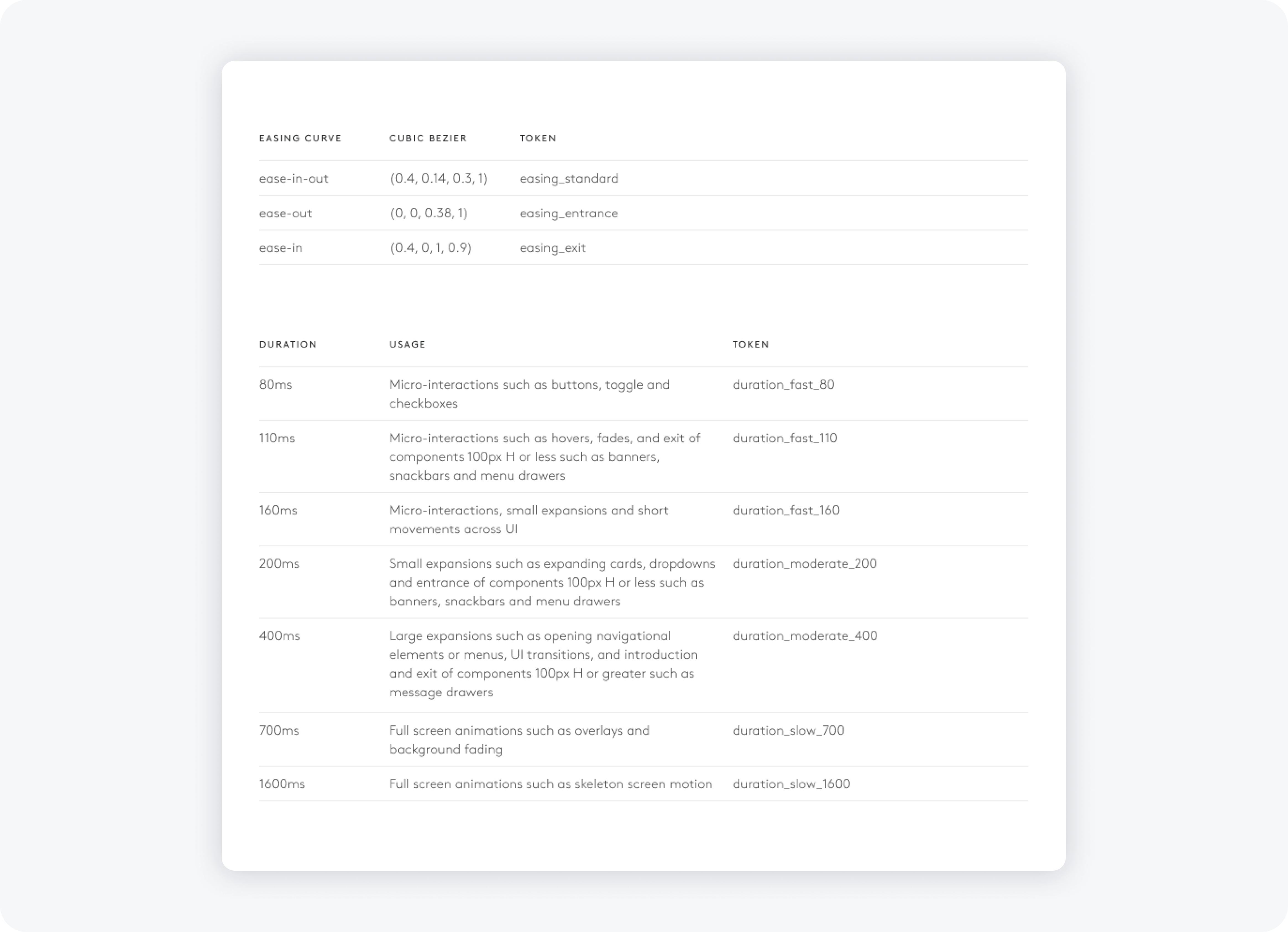
For clearer perspective on motion durations, I created a prototype utilizing the motion duration tokens. This assisted in representation when handing off to development and provided a clickable example to stakeholders on movement (speed) of components.
The custom, brand specific easings were also used in this prototype.
While exploring and designing motion elements, I kept developers in the loop — presenting prototypes in demo sessions. This ensured open communication, feasibility, and alignment. I acted as UX engineer to hard code or used Figma to animate.
I also handed of all motion specs with a corresponding chart showing states, unique curves, duration times, and additional notes with the component in the design system Figma file.
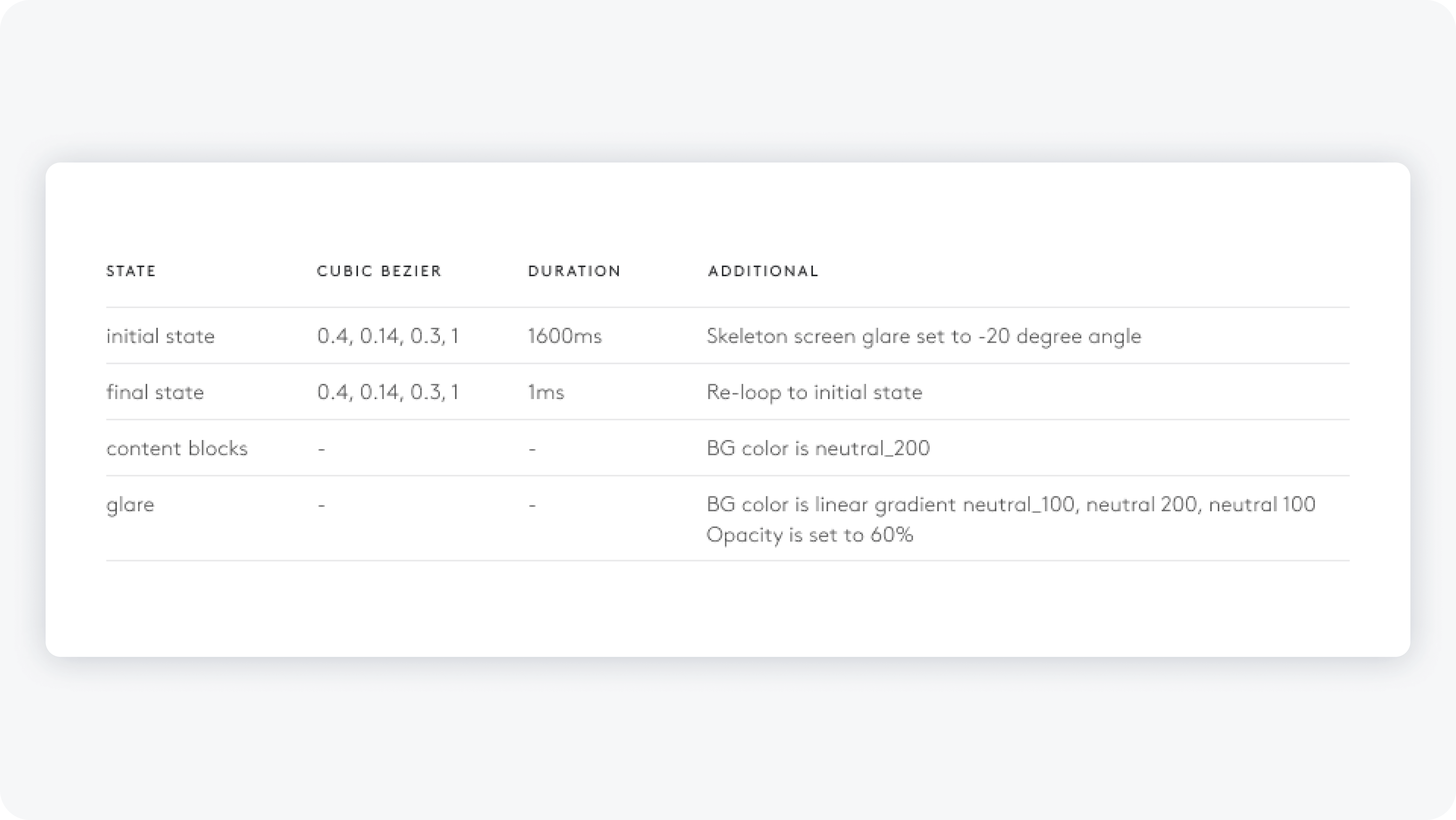
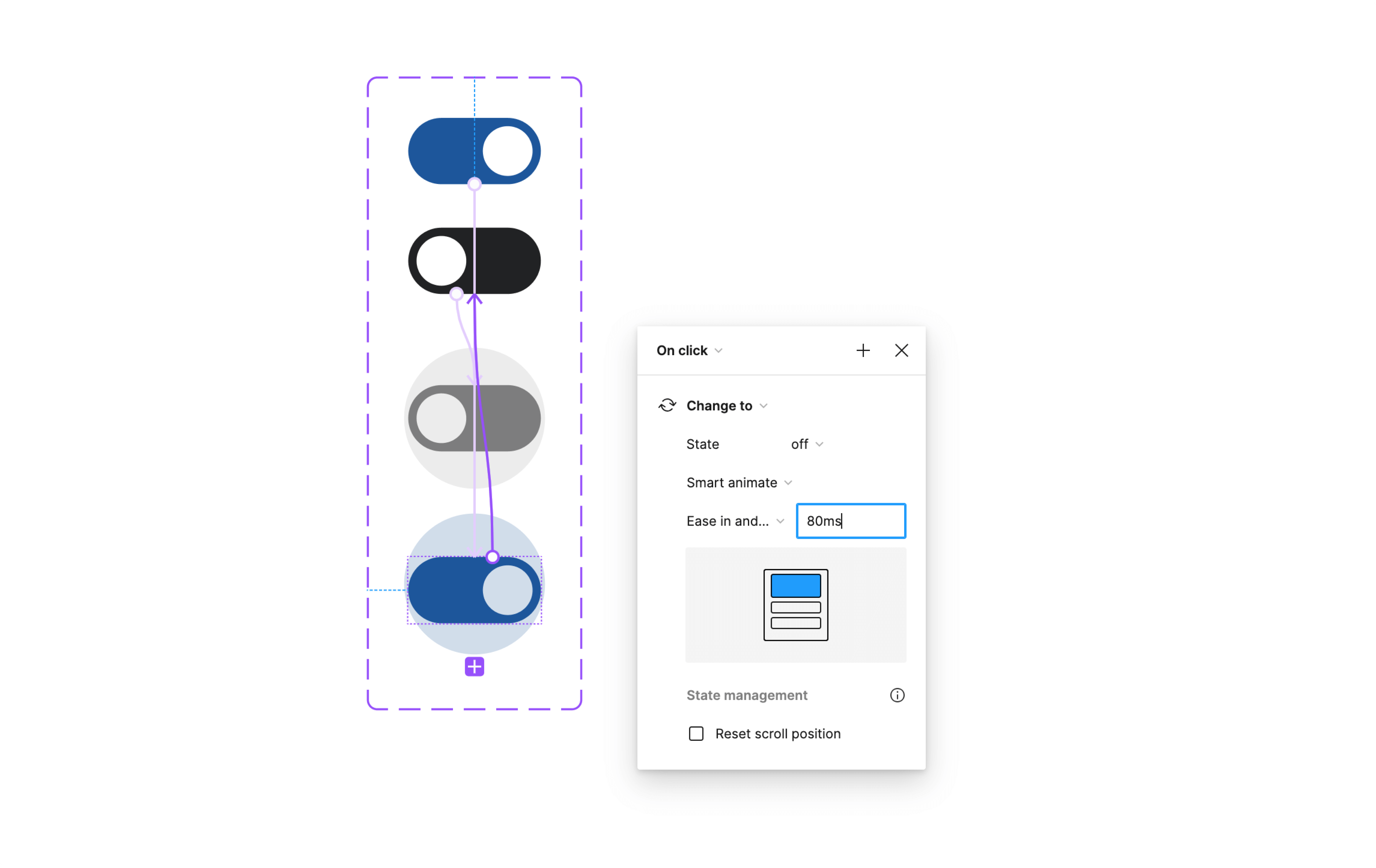
All components, even if prototyped with code, we rebuilt using Figma Interactive Components. Because this prototyping tool, with Smart Animate, was in its infancy, several work arounds had to be made (including adding additional states) to accomodate seamless interactions. This was done so designer could pull a component and have the same consistent interactions in clickable Figma prototypes.
The keypad component was the first component to test motion design. When creating the keypad component, in the same way I was aware of button spacing and color usage for accessibility, I was also critical of flash threshold. This component was also the only component utilizing multiple animations which would need to align with mobile, tablet, desktop, and translate to physical devices as well. Working with industrial designers, it was required to sync LED lights and timing for a cohesive experience.
Because of our aging demographic, ADT users in this group stated they sometimes miss important alerts or messages. To correct this, I emphasized alerts with a soft, spring animation. For the digital natives, they claimed our alerts took to long to disappear. For them, I provided a swipe affordance to quickly dismiss.
Speaking with users, I found confusion around tasks in complex smart home systems. To address this, I implemented touch points to confirm clicks, ensuring task completion and enhancing accessibility for older users.
To inject the experience with delightful interaction, I experimented with sizing of CTA's when tapped. This not only provided an interesting, tactile button, but enforced task completion. It also serves to alert users of unintentional taps.
Motion design guidelines also carried over to video content. To curb accessibility issues, I ensured all moving content (web video, animations, etc) would have the affordance of a stop or pause function. Taking this step further, the digital app experience follows reduced motion settings implemented on a users device.