

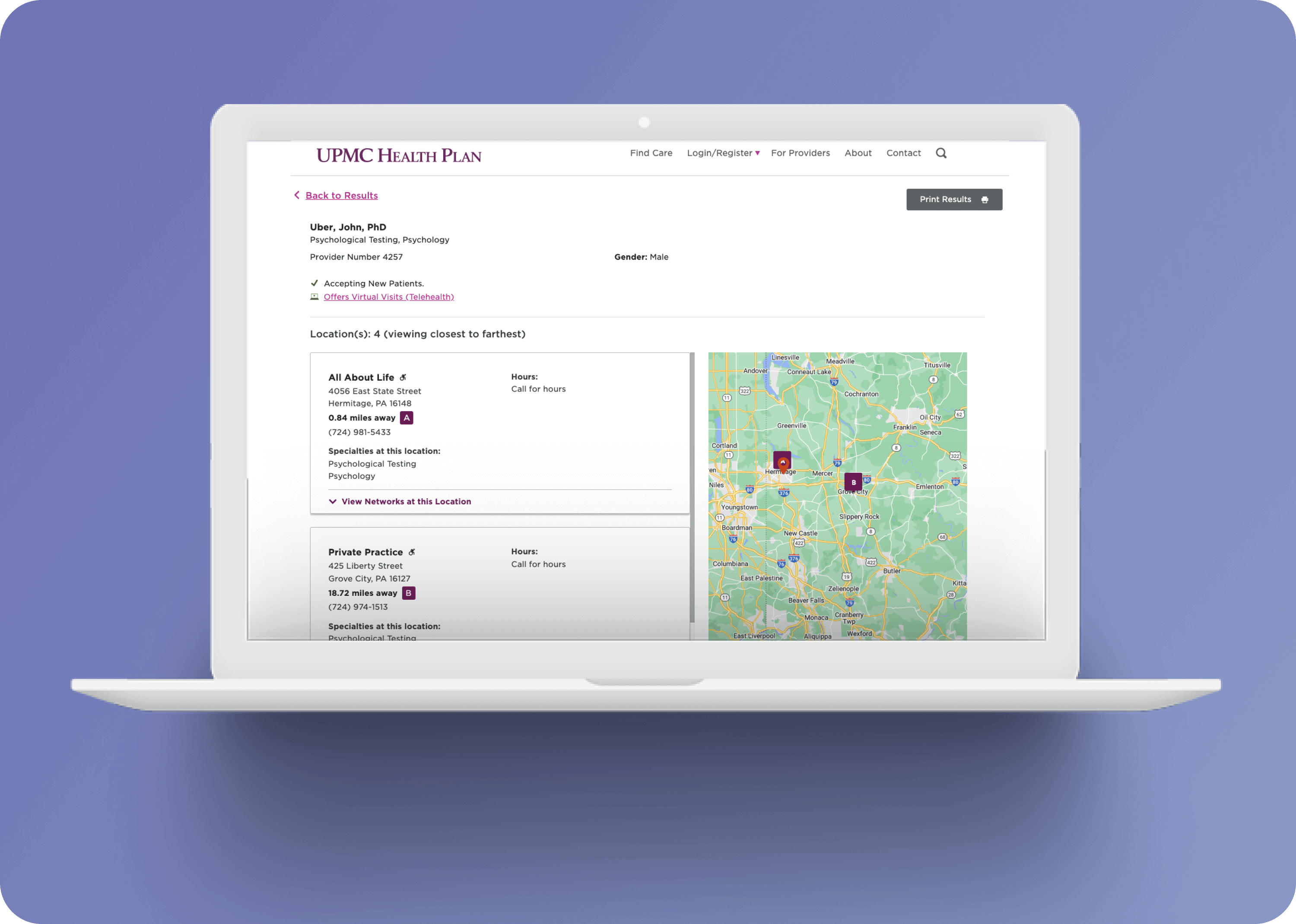
Designer & Researcher
2020
Sketch, HTML, CSS, Javascript, UserZoom
We serve a diverse user base, including commercial members, Medicare, Medicaid, SNP, CHIP, and more. Our customer support team and even providers use our public directory for assistance and up-to-date information. While health insurance members are our largest group, our key power users are the customer service representatives. However, they are often limited to only a distance filter in the directory. This presents a financial challenge due to the costs incurred from member calls and duration of each call.

We conducted a heuristic SWOT analysis on major competitors like Humana, Oscar, RxList, Express Scripts, and others before we could discover user issues with testing. This process revealed insights into the experience based on identified strengths, weaknesses, opportunities, and threats.
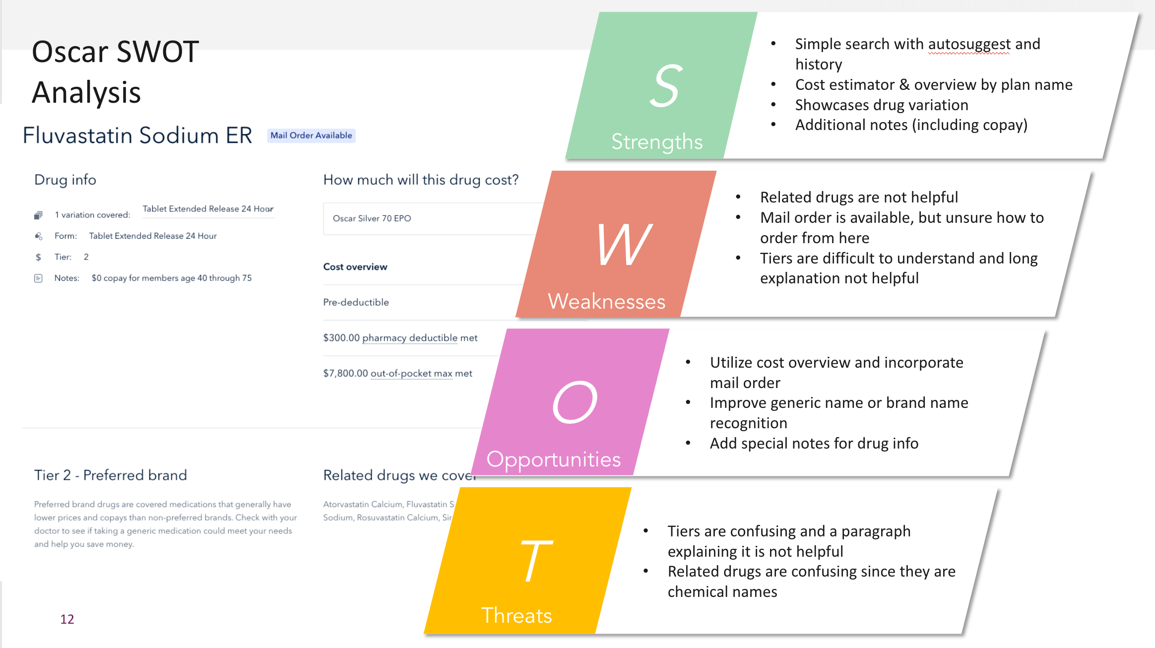
To reduce UPMC's call costs, we aimed to enhance our interface for friendlier, more effective searches. Issues identified:
After evaluating, we recognized addressing all simultaneously would be challenging. We consolidated problems into a single "How might we" statement to establish a clear objective.
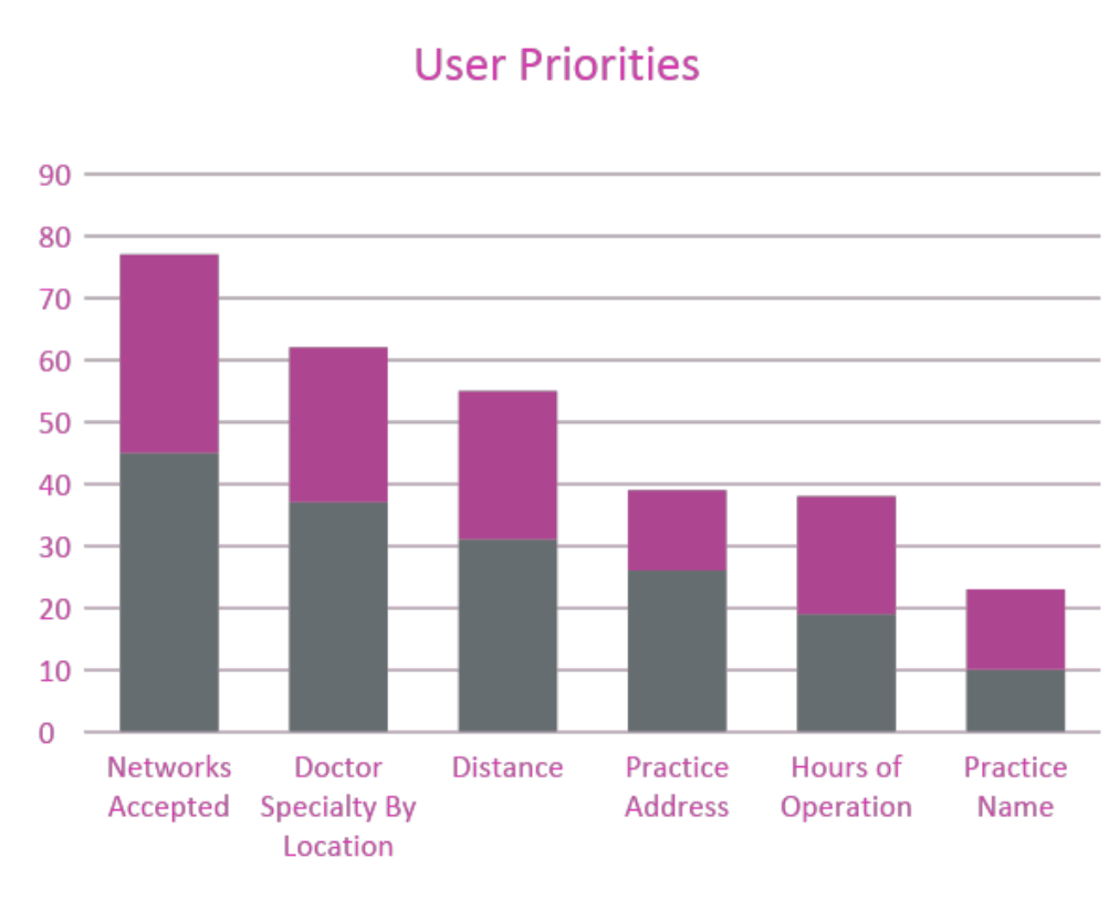
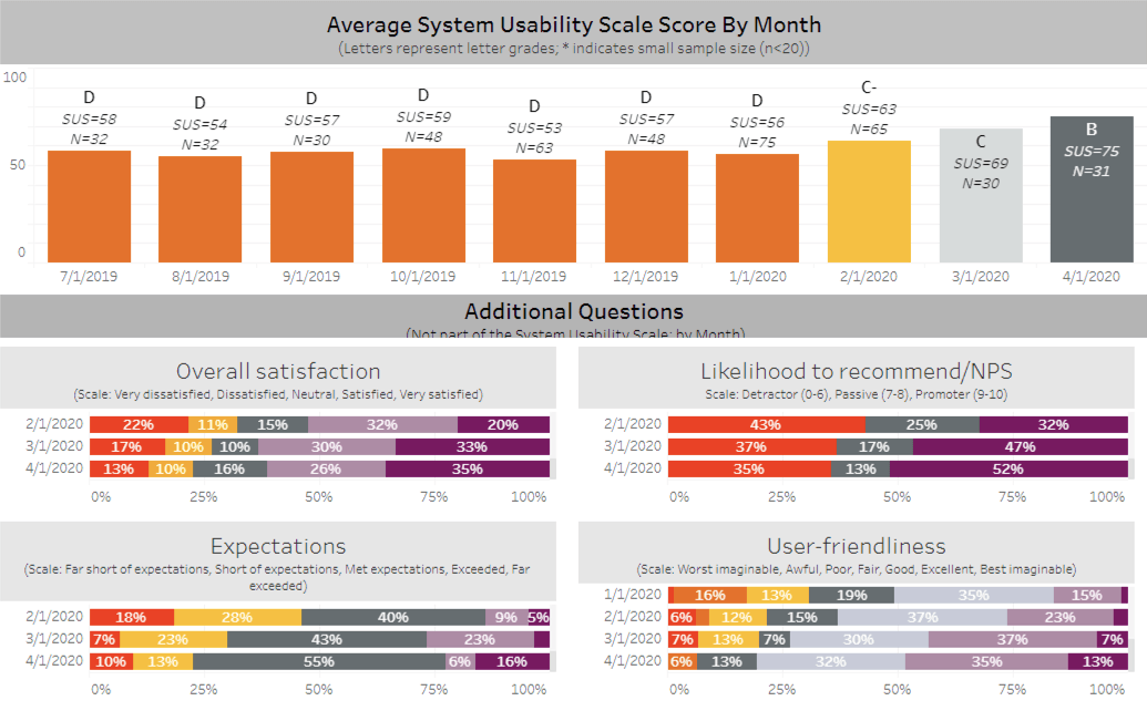
User issues primarily revolve around interaction, leading to unexpected outcomes. To address this, we engaged power users—our customer service reps—to identify common pitfalls. The identified problems surpassed our expectations, prompting collaboration with business leadership. Our overarching challenge became: "Craft a predictable search experience catering to user needs." We also linked success metrics: system usability score (SUS), net promoter score (NPS), and percentage of users using filters.
Teaming up with another designer focused solely on the product, my task was to familiarize the team with key member journey points and identify our targets for future sprint goals. I mapped user experiences from different starting points and led validating brainstorming sessions with the product owner, project manager, and the other designer to address identified challenges.
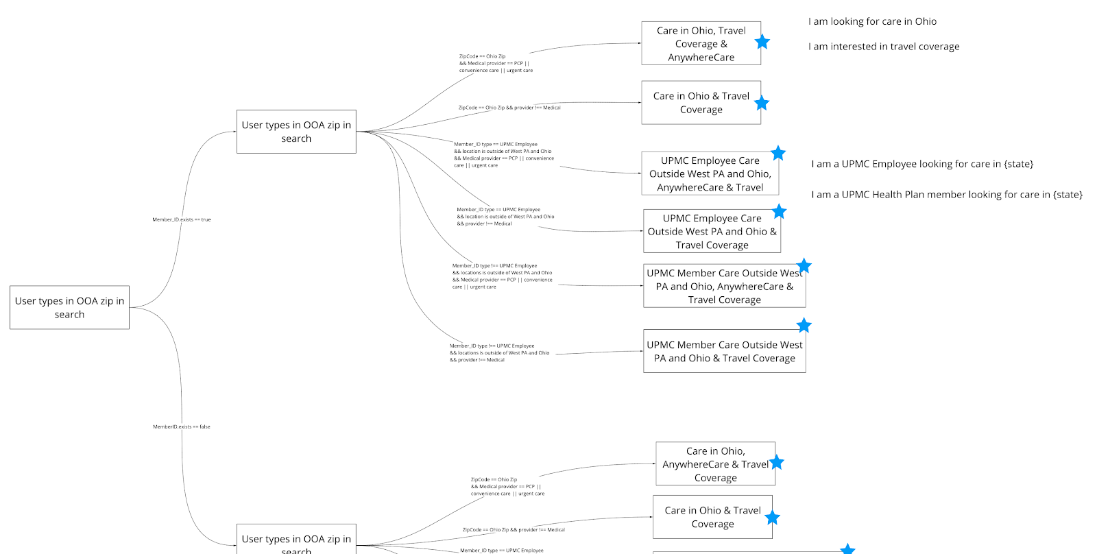
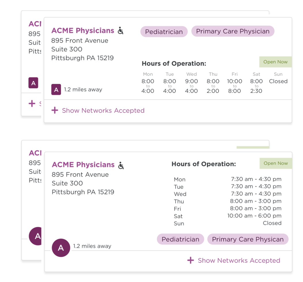
After identifying areas for product enhancement in the user flow, I delved into ideation to address specific issues. This encompassed refining card content, scroll interface, filtering, error messages, and empty states. We tackled each usability challenge individually, conducting virtual A/B tests and collecting user feedback on task performance. While many improvements emerged, what stood out were polarizing results with varying outcomes. This prompted a design pivot and the creation of new design approaches.
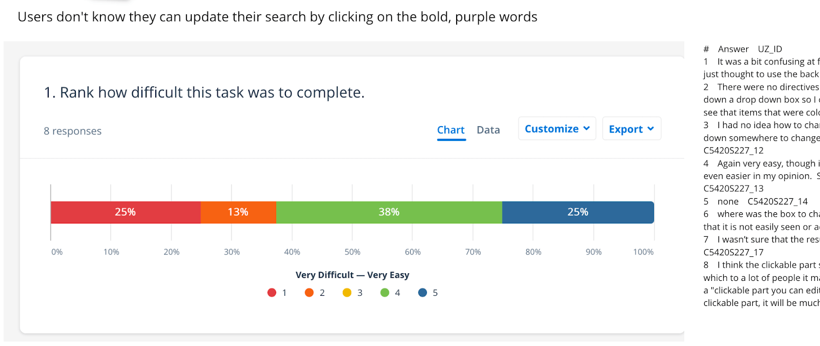
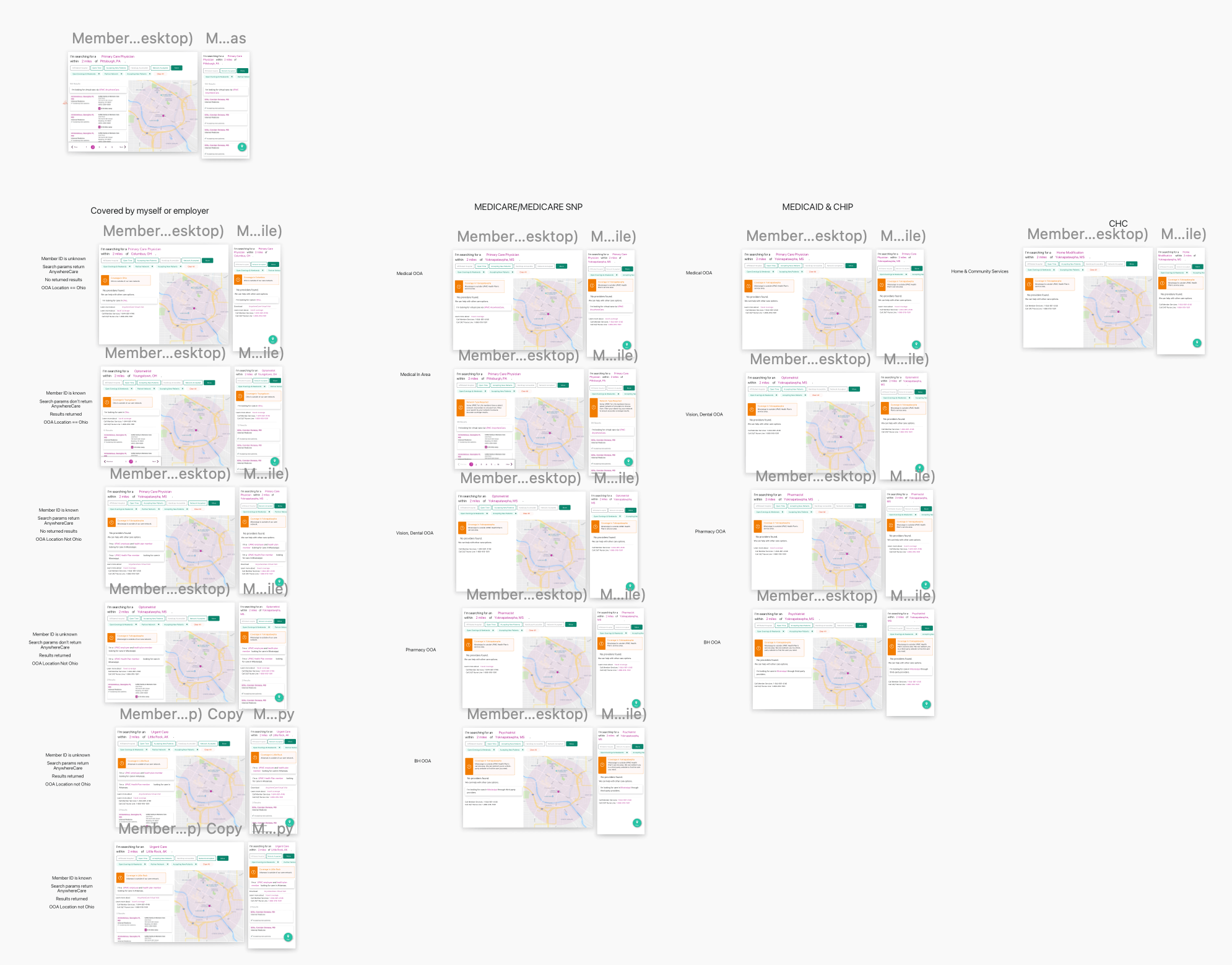
While we understood not all searches yield results, users' options vary depending on their medical plan status. For example, Medicaid members may have different resources compared to commercial members. Designing each page accurately for these differences was crucial for smooth engineering handoffs. We aimed to streamline the handoff process for engineers as much as possible.
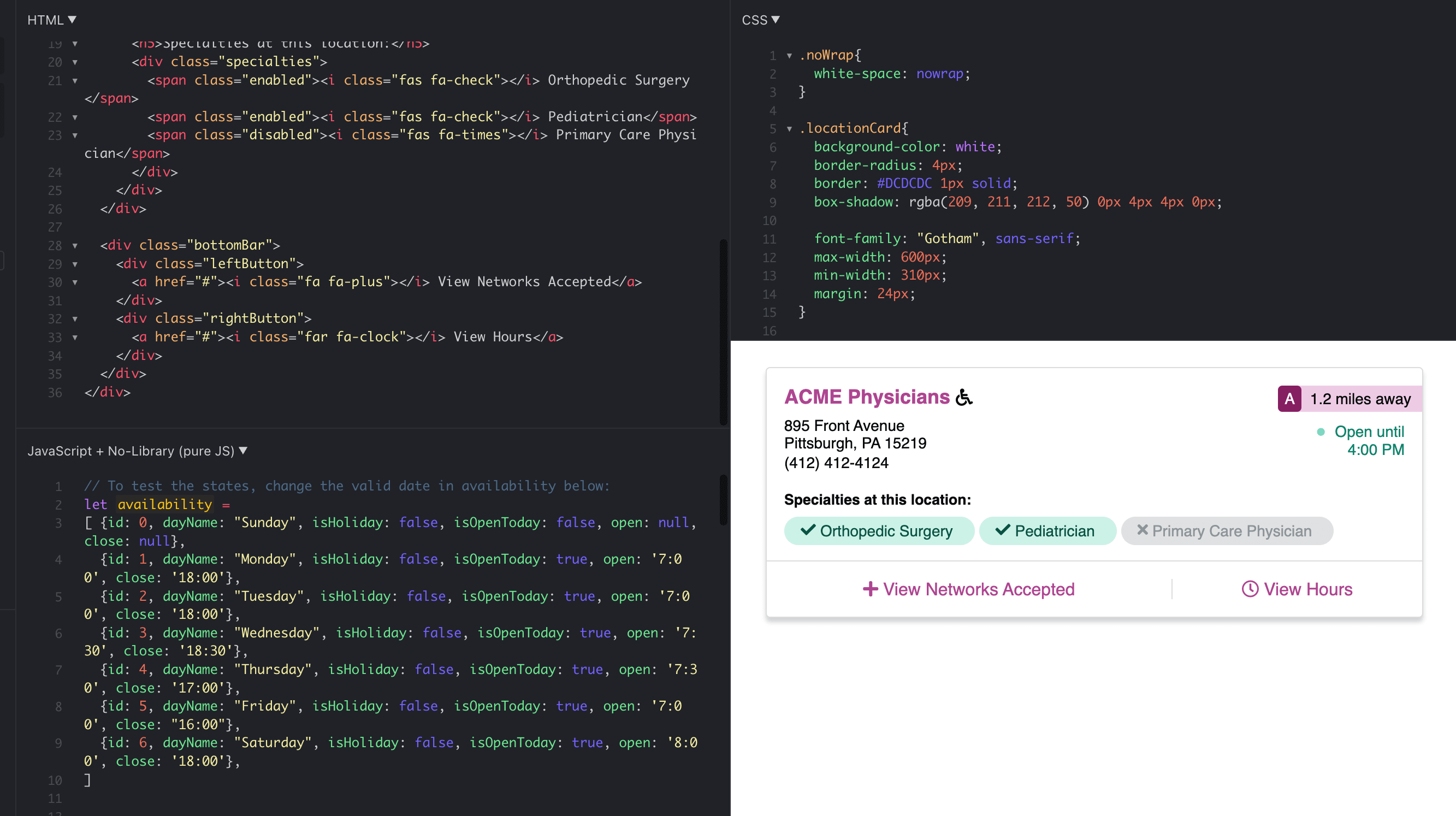
To enhance stakeholders' and engineers' understanding, I developed a prototype using HTML, CSS, and JS. Collaborating closely with the engineering team, I established deadlines according to build complexity. While not suitable for every project, this approach was imperative due to significant user-validated changes in the product, requiring alignment with the tested prototypes.
After successfully delivering a well-tested product meeting our established metrics, we left notes for future enhancements. Our SUS score improved from 56 (D) to 75 (B), NPS rose from 32% to 52%, and filter usage increased from 3% to 24%. These results signaled progress in enhancing the member experience, yet we acknowledged the need for further improvement.
The upcoming tasks involve additional product design endeavors. Further research on language is needed, striking a balance between clarity and the complexity of the insurance industry. Additionally, we addressed missing features in results cards, extending beyond our current dataset. These challenges guide our ongoing efforts to continue refining the product.
To provide engineers with a clear understanding of interaction and motion design, I created a clickable prototype featuring mock content. This effectively resolved issues like dual scrollbars and buried content within headers and footers, resulting in a satisfactory outcome.