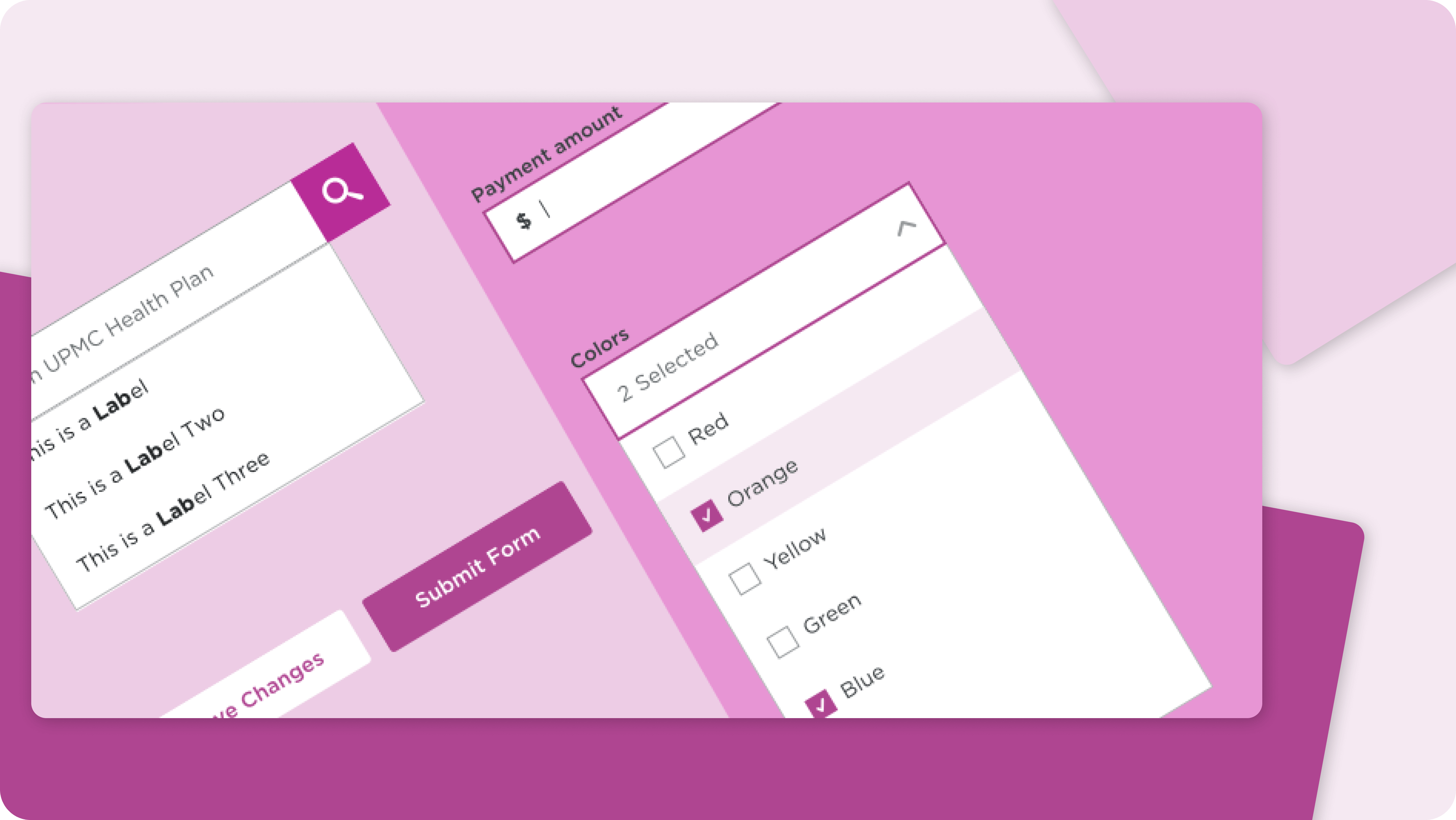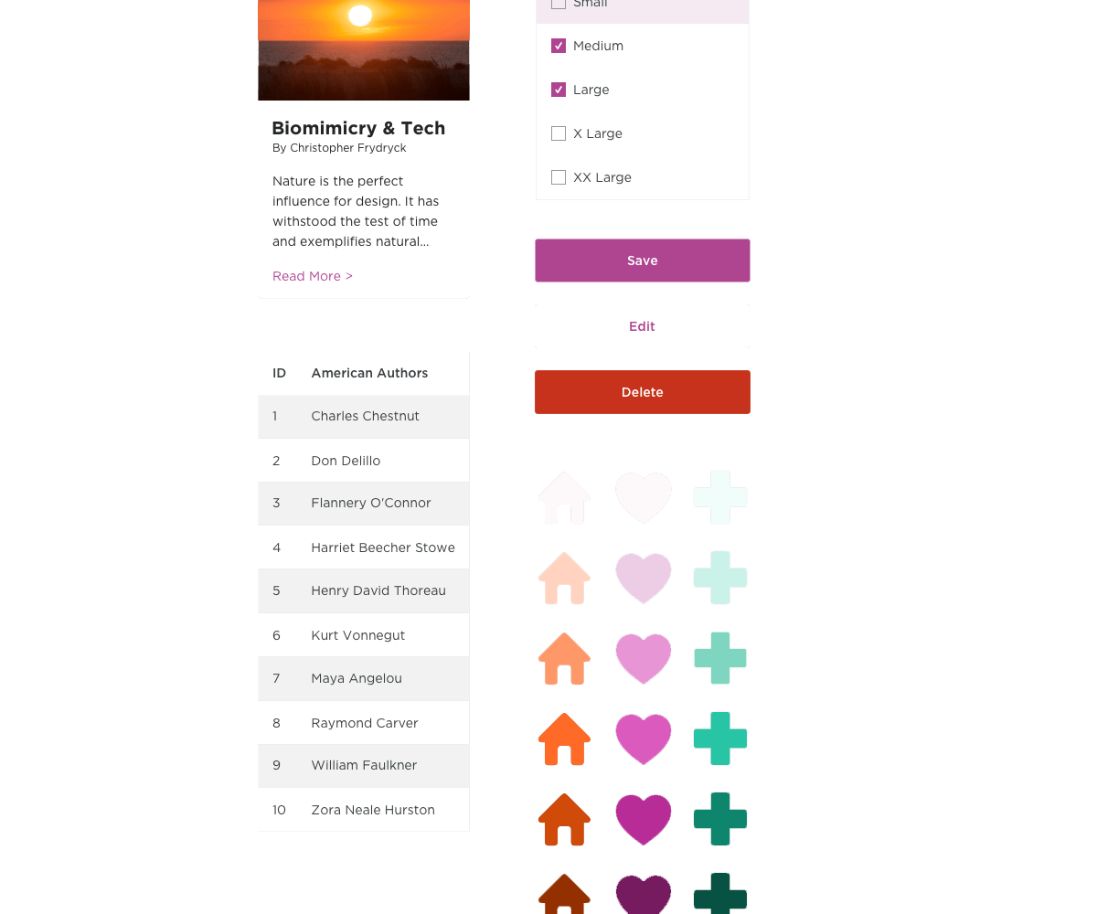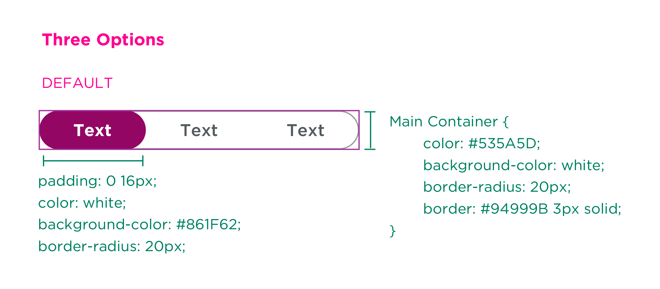

My role on the design system team involved reading guidelines and working with visuals — making an inclusive UI kit for the Sketch library for all functions and states. I also performed component QA and closely worked with React devs, handing off visuals and code specs.

Designer & Researcher
2019
Sketch, HTML, CSS, React, Angular
As the lead UI kit designer, I realized the importance of understanding our users, who happened to be all around me. I created a test plan, assessing how designers, with varying backgrounds and Sketch proficiency, responded to min/max lines, margin, and padding overrides.
We learned users appreciated padding for spacing accuracy within elements, finding margins confusing & unnecessary. Novice designers adhered to exact margins, an unintended consequence of excessive guides. We decided to exclude override component guides to avoid restricting users, retaining only padding for future pattern designs.
Before a component build, I review guidelines — assessing complexity. Patterns like cards may lack proper Sketch overrides, while others like toggle switches or dropdowns might have various designs and state values.
Fortunately, my coding background and grasp of component prop values enable creation of functional pattern maps. Sometimes, I sketch out physical diagrams of component states, ensuring comprehensive coverage and avoiding the need for revisions.

After completing the architectural build of a component, I move to Sketch. I refer to the component map and my team member's write-up to ensure it meets user needs.
In component design, we aim for visual consistency and seamless nesting of elements. For example, inline links and text should harmonize visually.
Uniformity in overrides and naming conventions is crucial, especially for similar patterns like multi-select dropdowns and regular dropdowns. Attention to detail is essential to avoid inconsistencies in size between patterns, whether on mobile or desktop.

Once Sketch is done, I create a specs artboard. If needed, I collaborate with the component's developer on props, CSS modules, etc. I upload the document to Zeplin for future reference by any developer.
Our design system is coded in React and then transpiled into Angular for UPMC's web projects. I have development experience in these frameworks and work closely with developers from various projects to integrate Orchid successfully. We're expanding our component library and enhancing developer documentation for public npm access.

We aim for a speedy idea-to-live design process, acknowledging the inevitable bugs. I'm on-call to address team issues and assist developers with component-related queries.
Working on the first project to adopt Orchid, Marketplace — the design system has sparked interest among multiple product managers for adoption.
The projected ROI of Orchid has been 120%, with a 35% shorter lead time.